Coding html websites isn’t the hardest thing there is, but not everyone has the time to learn it, and that’s why WYSIWYG html editors exist. If you aren’t looking for a perfect looking website, you can even use word for this, but if you want to have an editor designed to make html websites, you’ll need something like frontpage. Unfortunately, this software isn’t the cheapest software around, so I’ve looked for some free alternatives and OpenBexi Creative is one of them.
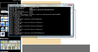
Open Bexi is an interesting application, not only because it’s free, but the way you use it is also quite interesting. To start it, you open a command prompt which starts the Open Bexi server and very slowly the application starts. Not as a stand alone application, but in a firefox browser which is included in the package. When trying some other open source web editors I saw that most of them work this way, but I do think it is a slow and unprofessional way to let your application run.

The command prompt that opens Open Bexi runs "quietly" in the background accidentally closing it can be catastrofal
Unfortunately unprofessional is a word that perfectly describes Open Bexi Creative. Since it’s an browser runned application, it looks like a website with frames: you have a main working space and a sidebar full of buttons. The first unprofessional thing about those buttons is that they look like they’re made in Paint (or at least like they’ve been edited in Paint). The second thing is that the buttons aren’t obvious. I can really take some time before you know which button is what. Next to that, the right-click menu is fully customized by the creator of Open Bexi. So there are no submenus but horizontal seperators that, in combination with the relativily large font, make the menu quite large and chaotic.
Of course, looks aren’t everything, but the chaotic positioning of the buttons and the sidebar system make it hard to navigate. For example: if you select an object in your workspace, the sidebar shows the details of that object, but the most useful buttons disappear (something that could really be avoided with static button bars on the top of the screen). After you’ve figured out how to get back these buttons, you need to figure out which one does what because of the somewhat confusing images. This wastes a lot of time and, of course, slows down the creation of your website, even if you want to do something simple as opening another project. It is a shame that the navigation is so bad, because this software really works.

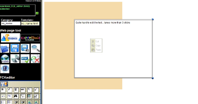
After selecting a text field, you can edit the text, but the FCKeditor options let the main toolbar disappear
After you’ve figured out how to find every option this application offers, you can actually make some nice websites by just dragging, editing and coloring objects with clear wizards and editors. As a bonus, you can even create websites that contain nice javascripts (clocks, tabbed pages, etc.) without any knowledge of javascript or html, and it must be said that you really get what you see. No tables that change from size when you really view the website in a browser or scripts that won’t work: just what you have created. This also has a downside. You won’t get websites with relative positions (so that it will change from size if you have a larger screen, or so that your website will automatically be centered). Next to that, it’s quite hard to see how it will look in a real browser because the workspace is 4/5 of the size it will have in the browser. The result usually is that you will get what you see + 1/5 of the width with empty space. There’s no automatic correction for this loss of space in the workspace.
If you summarize everything in this review, you will notice that there are a lot of negative points about Open Bexi, but these points of critisism are all centered around one thing: the layout. The other parts and options of Open Bexi really DO work, only the layout makes it hard to use them. I do personally think that if you have zero knowledge of html, you can do more with Open Bexi than with the popular open source website editor "Kompozer" because of the javascripts that you can implement in your site and the extremely precise WYSIWYG editing. Nevertheless, Open Bexi would be the weakest one if you would compare it with Microsoft Frontpage, simply because it lacks a intuitive workspace and it really misses a lot of options that Frontpage does have.
Evaluation
6/10
Pro’s and con’s
+ Easily implants javascripts into your website
+ You don’t need any knowledge of html or javascript
+ What you see is really what you get
– Chaotic and complex Interface
– No intuitive workspace
– A little bit too WYSIWYG
Platforms
OS independent
Links
Website
Project Website
Download Open Bexi Creative


When I installed this, the folder size is about 132MB but in control panel, programs, it reports it’s size as 132GB!